Ontario Municipal per Capita Transit Spending
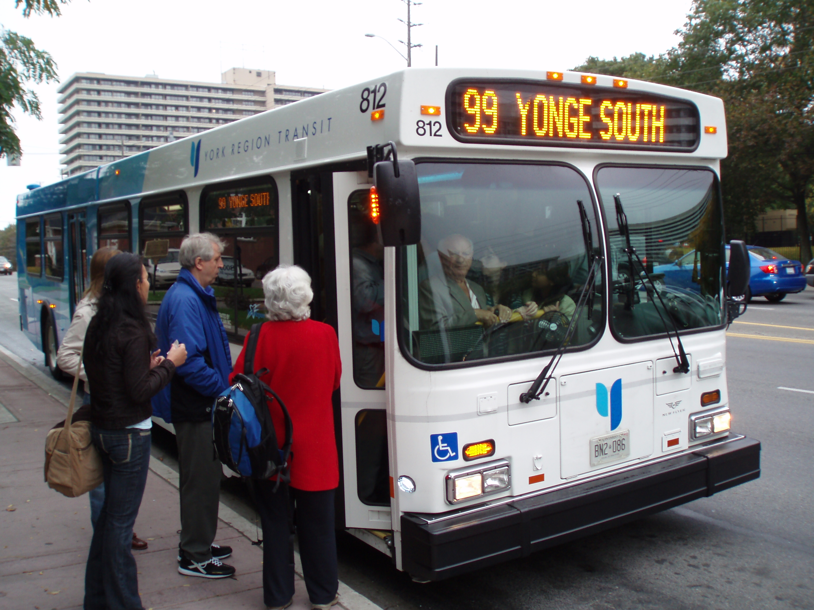
Municipal transit is a hot button issue these days, especially in Toronto and the GTHA. With issues surrounding funding and expansion being especially pertinent, I’ve always wondered: is there a better way to sell both governments and other taxpayers on the idea of transit.
Transit is important. It is a public good that has a variety of economic, societal, and health benefits. But as much as we can harp about specific benefits, many of them can be abstract, and it may not necessarily connect with the disgruntled taxpayer or public servant.
A person that is looking at the newspaper or an article linked on Facebook and will only see the gigantic aggregate number which, for some municipalities in Ontario, could reach hundreds of millions of dollars. This becomes especially pertinent for people that are fiscally conservative that may abhor the large costs the public purse has to spend on transit.
DISCLAIMER: Before I go on I’d like to say that I do work for the Ontario Liberal Party, but the views expressed here are not a reflection of the views of the party. On another note, this post was not produced under the direction of my job duties. I’m just interested in civic issues and playing around with data 😊
So how do we get past this?
There’s a group at Civic Tech Toronto called Budgetpedia that is working on efforts to make municipal budgets more accessible. I love their work, and have always wanted to get involved but never found the time given my other commitments.
But the other day, one of the Budgetpedia members posted on the Civic Tech Toronto slack an article about the operating budgets of Ontario municipalities.
This came with a great graphic which can be seen below:
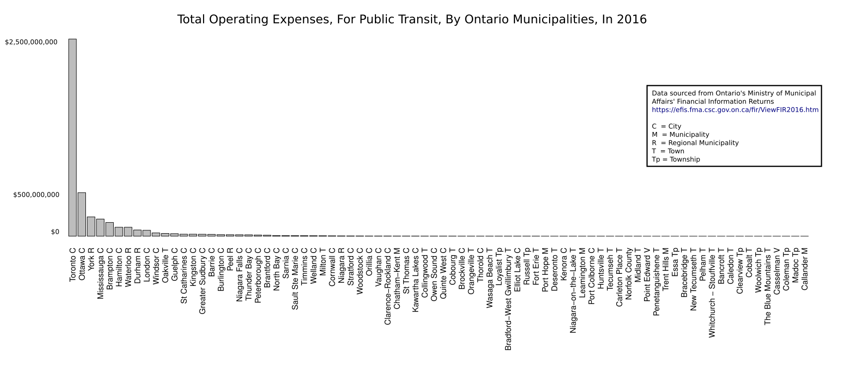
It’s a bit hard to see here, but in essence it is a bar graph of the total transit operating budgets of all the municipalities in Ontario with a transit system.
Not surprisingly it shows that Toronto’s operating transit costs dwarfs that of other municipalities in Ontario. However, what was interesting was that Toronto is not just a heavy spender, but it takes up 56% of all of the province’s transit operating costs.
But it got me thinking, instead of just looking at aggregate cost, what is the relative cost? For every person in a municipality, how much of your taxpayer money is going towards sustaining the buses, trains, and subways that run across the province?
Transit spending from a per capita perspective
I decided to reuse some of the data in the above article, and scraped the populations of each of the municipalities mentioned. With this data in hand, I came up with the following graphic:
These are all the municipalities in Ontario with transit systems. I measured each cities operating budget for transit per capita (ie operating budget divided by the municipal population). The data is sorted in order from least populous to most populous municipality.
Just off the bat we can find some interesting insights:
- Although Toronto outpaces all municipalities in aggregate operating spending (by a metric boatload), it is not the most expensive transit system on a per capita basis. Though it should be noted it is still in the upper tier (along with all the other major urban centres) and is second overall.
- Waterloo is far and away the most expensive transit system on a per capita basis. Being a student at Waterloo this is extremely interesting, I wonder why this is the case.
- Rural towns and smaller urban centres can now be much better directly compared to larger ones. On an aggregate scale, Toronto’s large spending numbers just dwarf the graphic but here we can get more subtle comparisons.
- Many municipalities transit systems are serving less people than others, yet costing much more than other municipal systems with much higher populations.
Limitations
Now these aren’t perfect comparisons. From what I can think of these are some of the limitations of a graphic like this:
- This doesn’t factor in capital costs which can be a huge expense for both the province and municipalities.
- It also fails to account for the fact that not all of municipalities population are taxpayers.
- Regions like Peel and York are ranked highly in population, but they don’t shoulder the main burden for funding operating costs because they are offloaded to municipalities within those regions like Brampton and Markham. This makes them seem like wizards running extremely low operating costs per capita.
- Some municipalities may have low populations within their borders, but their transit system may have a larger catchment area. Meaning that people outside of that population are also using their transit, increasing costs per capita.
Framing the conversation
I think we too often tend to talk about huge aggregate numbers, but then it becomes so hard to have a conversation comparing transit systems across the province. Especially because Toronto seems like they hog the lions share of funding.
I think a graphic like this can be really useful to frame the conversation. Whether you’re an activist or concerned citizen or public servant, but operating costs in relative terms allow us to better conceptualize the personal cost of supporting a transit system. With this dollar amount you can look at your own tax bill and understand how much of it is going to transit (roughly).
Thanks for reading!
If you’re interested in technical details of how I have all the code on Github under the ontario_transit_spending folder.
In brief, I used Beautiful Soup to scrape the data, Pandas for data handling, and Plotly.py for the interactive graph.
If you have any thoughts and would like to dialogue about transit or really anything else, you can give me a shout @jtloong
Comments powered by Talkyard.